There are many composition guidelines which can be applied in almost any situation, to enhance the impact of a scene. Below are some of the most popular and most widely respected composition rules.
#1 Simplicity
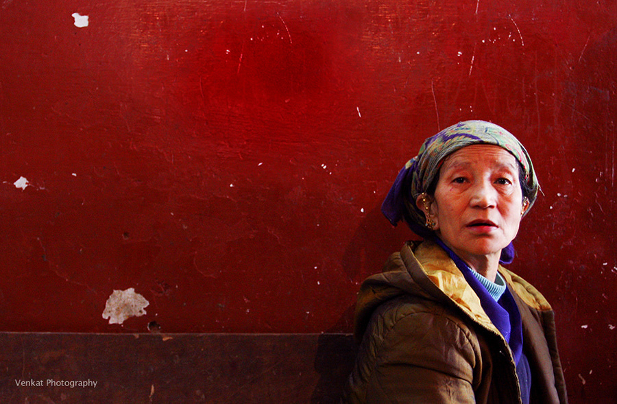
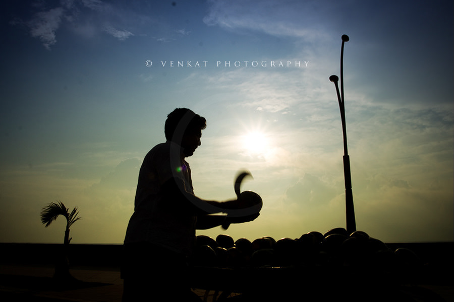
In photography, the technique of simplicity is used to achieve the effect of singling out an item or items from their surroundings.
Simplicity is one of the common underlying photographic techniques; a cluttered picture distracts the eye and takes away from the subject. A simple picture can be achieved by getting closer to the subject, which is also one of the main rules of photography.
Simplicity is one of the main components of most good photographs. The simpler the picture, the easier it is for the viewer to comprehend the subject and appreciate it. Cluttered images and backgrounds are less visually pleasing and more likely to cause the subject and lesser objects to confuse each other visually.

#2 Rule of Thirds
The rule of thirds is a compositional rule of thumb in visual arts such as painting, photography, and design. The rule states that an image should be imagined as divided into nine equal parts by two equally-spaced horizontal lines and two equally-spaced vertical lines, and those important compositional elements should be placed along these lines or their intersections. Proponents of the technique claim that aligning a subject with these points creates more tension, energy, and interest in the composition than simply centering the subject would.
The photograph to the right demonstrates the application of the rule of thirds. The horizon sits at the horizontal line dividing the lower third of the photo from the upper two-thirds. The tree sits at the intersection of two lines, sometimes called a PowerPoint or a crash point. Points of interest in the photo don’t have to actually touch one of these lines to take advantage of the rule of thirds. For example, the brightest part of the sky near the horizon where the sun recently set does not fall directly on one of the lines but does fall near the intersection of two of the lines, close enough to take advantage of the rule.

#3 Balancing Elements
Balance in photographic composition is a matter of making pictures look harmonious. Each element in a picture has a certain amount of value in respect to all the other elements. Every tone, mass, shape, tree, rock figure, building, line, or shadow contributes a certain amount of weight that must be arranged correctly in the composition to give the impression of balance. The subject placement within the picture area is the factor that must be carefully considered.
The composition is kept in balance by two different methods: symmetrical, or formal, balance and asymmetrical, or informal, balance.

#4 Framing
In photography and cinematography, framing is a technique used to bring the focus to the subject.
Frames serve the double purpose of making a more aesthetically pleasing image and keeping the focus on the framed objects. They add depth to the image and can add a great deal to the picture when the frame is something related to the object being framed.

#5 View Point
The position of the viewer can strongly influence the aesthetics of an image, even if the subject is entirely imaginary and viewed “within the mind’s eye”. Not only does it influence the elements within the picture, but it also influences the viewer’s interpretation of the subject.
For example, if a boy is photographed from above, perhaps from the eye level of an adult, he is diminished in stature. A photograph taken at the child’s level would treat him as an equal, and one taken from below could result in an impression of dominance. Therefore, the photographer is choosing the viewer’s positioning.
A subject can be rendered more dramatic when it fills the frame. There exists a tendency to perceive things as larger than they actually are, and filling the frame fulfills this psychological mechanism. This can be used to eliminate distractions from the background.
In photography, altering the position of the camera can change the image so that the subject has fewer or more distractions with which to compete. This may be achieved by getting closer, moving laterally, tilting, panning, or moving the camera vertically.

#6 Geometry and symmetry
The “rule of odds” suggests that an odd number of subjects in an image is more interesting than an even number. Thus if you have more than one subject in your picture, the suggestion is to choose an arrangement with at least three subjects. An even number of subjects produce symmetries in the image, which can appear less natural for a naturalistic, informal composition.
Related to the rule of odds is the observation that triangles are an aesthetically pleasing implied shape within an image. In a canonically attractive face, the mouth and eyes fall within the corners of the area of an equilateral triangle.

#7 Cropping
In an ideal world, every photo you take would be perfectly composed. However, in real life, many pictures could use some improvement. Often, thoughtful cropping can make the difference between a mediocre image and a better one. Cropping a picture just means eliminating or trimming off edges.


