Keeping up with the latest web design trends and giving your website a visual overhaul can help a great deal with maintaining a professional appearance. Although a shift in trends can be hard to spot from one year to another, in a couple of years to a decade, the changes in direction can reach dramatic heights.
The year 2022 has been a refreshing one for many as things keep opening up around the world and businesses are looking to freshen up their digital looks. At the same time, it has also been a year of somewhat brave experimentation in the digital space. To sum up the recent happenings in the web design sphere, these are the trends to keep a watchful eye on:

1. Visible borders
To challenge the notion that all modern web design necessarily has to be borderless, web designers have started experimenting with going back to the roots and emulating the feel you’d get from the very first websites in the early era of the internet, which means the ones with borders.
As opposed to churning out a digital entity that floats somewhere in the digital space, websites with visible borders tend to be well defined in terms of where they begin and where they end as well as how far they can stretch.
It turns out that deliberately going with visible borders is not archaic at all if it’s executed properly. To give you some perspective, the results often tend to look like a fancy brochure or a business card in a digital form. Plus, you get to define various subsections of your website, which can look quite dandy in some niches (cooking and recipe sites are a good example of this).

2. Interactivity
At some point in the past, web design started moving away from resource-heavy elements such as the now-retired Flash. The original idea was to favor responsiveness and conserving resources. However, as technology evolves, so does the computing and processing power of an average consumer-grade device, which means engaging interactive web elements are gradually making a comeback.
For obvious reasons, as a webmaster, getting your hands on a Hostinger coupon code India to ensure optimal server capacity is going to be crucial if you’re after resource-heavy yet interactive web design elements, but the good news is that most modern web architecture can take it. This opens the doors to experimenting with under-utilized approaches such as triggering a specific animation when a user scrolls past through a certain point of the page.
Interactive elements can be tied to a wide range of user actions such as swiping or dragging – these can serve as their triggers. This new approach to interactivity gives you the creative freedom to make websites that almost resemble a constellation in an art museum, the kind that entices you to keep exploring the depths of its construction.

3. Bold typography
As it so happens, bold typography is one of the best ways to make a statement you’d like to pop out of the mold and get seen. For example, this could be your company slogan or perhaps even one of the benefits on a sales page where you’re trying to convince the visitor to buy something from you.
On some occasions, bold typography can also play a similar role as an image, but without taking up as much space and server resources (these can be a concern if your first web design priority is smoothness and fast load times). Long story short, why complicate things where simplicity can find a place?
Think of using these web design elements in a similar way a journalist would use headings and subheadings to convey the most important points in an article. Bold typography simply is a powerful one-punch way to deliver the message.

4. Retro design
How to stand out from all those modern, almost sci-fi-looking websites your competitors are proudly displaying? By taking the opposite route, of course. In that spirit, simplistic and retro graphic designs are making a comeback in 2022.
Remember how things used to be in the 90s? Those quirky-looking bright background colors and fonts like Times New Roman may not be to everyone’s liking, but one thing is for sure: websites like these are hard to ignore. As a testament to the good old times, some web designers are now playing around with supposedly outdated ideas to see if it’s possible to make them viable with slight adjustments and tweaks.
In a lot of ways, there was a lingering feeling of freedom that you could get in the times when the rules of web design were pretty much unwritten, and the internet was unexplored territory. Back then, if you had told someone you were into web design, they would probably tell you to “get a real job”. Go figure.

5. Handmade graphical elements
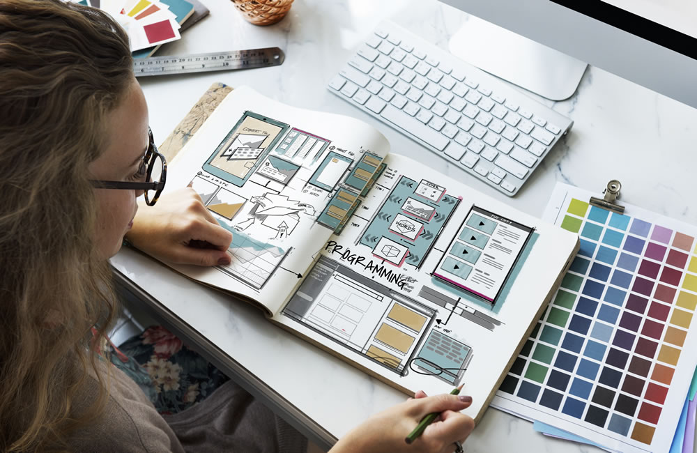
For some reason, the concept of DIY is making a comeback, and what better way to capitalize on this web design trend than incorporating some cookie cutter style of imagery on your website? If you’re in a niche that places a great deal emphasis on a personal approach and custom-tailored solutions, this is more than likely to strike a chord with your audience.
Anything handmade gives the impression that you care and that you’re a young soul who refuses to be set in one’s ways, much preferring to experiment and think of creative new approaches to things. Doodles, crayons, pencils… these are all tools of the creative trade, and you want to let your visitors know that you’ve kept the child in your heart alive.

Conclusion
Nothing ever stays the same and the same mantra applies to web design that seems to be taking leaps and bounds in 2022. There’s something liberating about it, something that takes us back to the way things used to be… but in a slightly different way. For those who aren’t afraid to experiment with an unconventional approach, the year has plenty of inspirational ideas to offer.


