
Creating content for web users is always a challenge. The key is the ease with which your content can be read and understood. Your visitors should be able to quickly digest the information you share – that’s a great goal to have on your website, portfolio or photography blog. A usable website will ensure your visitors are happy and will make them want to return to you.
Below are five easy and quick tips for enhancing your usability and readability. Use these tips while creating your site, or use them to double-check if everything is okay with your existing site. Any SEO tricks won’t help to improve your website engagement if it’s not usable. It’s better to work on website usability first, and, only after that, use some SEO and marketing tactics to give a boost to your business with the help of Linkflow.ai or any other white hat link building company. So let’s get right to the tips!
1. Work on Readability
Readability is the chief issue that indicates your website usability. If your site has small and hardly readable fonts, there is a big chance your visitors will leave the site in three seconds. In fact, it means that you would essentially lose potential clients.
Make sure that all the words on your site are clearly readable: adequate amount of whitespace, displaying lists using bullet points and proper paragraph formatting. Pay attention to all these small details to make your content more readable. Moreover, you can place your design elements, such as banners, sidebars and ad boxes, in such a way that they won’t distract users from important information while browsing the site.
Web pages should have readable content that’s highly visible to users. And, that’s when above the fold matters. This part of a web page can be seen without scrolling or navigating down further. The most important information, such as your contact details, search box, shop cart, call to action, and revenue-generating ads, should be found above the fold. Of course, the above the fold is where you should place your amazing photos.
Users tend to interact more with the content above the fold than below the fold. So, many website owners and publishers place all business site goals above the fold for greater visibility and readability. The visible part provides a better user experience when prospects land on the page, encouraging them to check other articles and photos on the website.
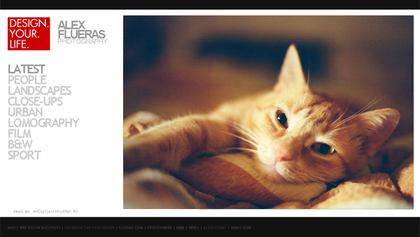
2. Provide Easy & Clear Navigation
Start working on your usability with navigation since it’ll move your clients towards decisions as fast as possible without them losing interest. Most of your visitors start with the homepage, so make what you want them to do clear. For example, you want them to look through your photographs or contact you, or read your blog.
As a new visitor of a site, I’d like to see the following menu blocks:
- Your photography examples (Galleries)
- Information about you (About)
- Pricing information (Pricing)
- Contact information (Contact)
Those should be the first links in your navigation. Keep it simple. Don’t confuse people with complicated words like “investments.” Not all people will guess that it means pricing. Also, there is no need to add sections like client proofing or clients list (eventually, you can add it as a paragraph on the About Me page). Focus on the most important actions, and remove clutter.
3. Ensure Your Site Loads Fast
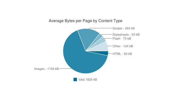
According to July 8, 2014, data gathered by HTTP Archive, the average webpage size is 1.83MB, and about 63.3% of that is images.
A webpage file size will depend on the number of images on the webpage, so your photos are a usability issue if they’re too huge. In order to improve your web preference along with usability, you need to optimize your image sizes and make them download as soon as possible. Image Search is the best option to find out.
You may use Photoshop’s Save for Web & Devices function that is a convenient feature to save photographs taken by high-resolution digital cameras for web-optimized formats. Use the “JPEG – Very High” preset setting, as it does not lower the quality of the image significantly.
Also, you can use various tools to reduce the size of your photos without losing the quality. For example, Smush.it from Yahoo. You can upload an unlimited number of images there, smush them and download smushed photos.
If your webpage is full of images, it can take a while for it to load. The users don’t tend to wait for the page to be downloaded. They can start reading text content and then look through the images when they’re done. That’s why width and height attributes for all your <img> elements are important.

Image element without width and height attributes:

Images without defined width and height attributes can cause shifting of the whole webpage because the browser does not know how big these photos are supposed to be. Such shifting will be annoying and make the user leave.
If the width and height of the images are clear, the browser will know the dimensions of the images that are still downloading, so it can put the correct placeholder for those images. This, in turn, avoids shifting of the content.
4. Create a Contrast
There are a lot of options while choosing the proper color scheme for your site. Just make sure it fits your niche properly. For instance, a landscape photographer may choose a green or blue color as a background, as it is associated with grass and sky. Vivid photographs look awesome on a clean white or black background.
Nonetheless, it does not matter which color you prefer – a photography portfolio is a kind of creative site where you can set your imagination completely free. The main thing is to make the contrast between font color and background color apparent. Otherwise, it could be an issue for readability.
5. Use Typography to Your Advantage
Typography pertains to the style and appearance of fonts that reflect your website’s language and your brand’s perception. The fonts on your website should be legible, easily readable, and web-safe (work across all web browsers and devices). For example, Open Sans is commonly used because it’s neutral, minimalist, and highly readable, which improves readability and overall user experience (UX).
The hierarchy of information shows the reader what text to focus on as guided by the fonts. For instance, a larger typeface should be on top of a page because it’s more predominant, like the H1 heading. The H2 heading decreases in size, and so as H3, H4, and so on. For your photos, make sure they also have the right text content to stand out.
Internet users read webpages in sections and blocks. In other words, that’s called “block reading.” While looking at the webpage, we see some particular chunks of information, not the whole page (as is the case while reading a book).
So use headlines, sublines and default body-size text properly. Also, avoid using colors for fonts other than links. You can use red for some really urgent information. But take into account people who are color blind. For them, this “red” may look “grey.”
Web users tend to skim content. You can design the pages with skimming in mind to improve usability. Make the first words count, as users tend to read just a few first words of each headline, link and subline while scanning the page. Also, use the active voice as a powerful writing device.
Bonus Tip: Place the Logo Correctly
I’d like to share one more small hint with you. Almost all websites place the logo on the top, left corner of the web page. But why?
According to various scientific research, when a person opens a website, his view runs from left to right. That’s how people read. That’s why the best place for a logo is the top, left corner of the page.
Tools and Resources
The tools and services I put together below will help you create a website that users will adore! Here, you’ll find a website builder, tools for image and color optimization, tools to check your website loading speed and much more.
- Defrozo is a free brand new marketing platform for photographers. It has two chief features: drag & drop website builder and cloud media library which you can use to build great usability-optimized website. There are also other features in the development stage, such as Online Proofing, Scheduling, CRM, Ecommerce, and Client Websites.
- CrazyEgg will let you know which places of your webpage grab the most attention. It will show you the most clickable places to get to know your visitors’ interests and place the ads or call-to-actions correctly.
- Image SEO tool checks your web pages and shows various image errors, such as the lack of alt, width and height attributes in your image elements. That’s what I was talking about in the article above.
- GTMetrix is a free tool that assesses the causes of site’s slowdown. It’s a great way to easily identify what aspects of your site’s code aren’t working, as it easily identifies script, CSS and image errors.
- SpurApp. Go to the app and insert a link to your site. After watching a charming western loading screen, you’ll see the memory test of your site. You can see whether your design still works in grayscale, high contrast, if it’s blurred and at different zoom levels.
- Optimizely is not a free service, but you can use the 30-day free trial to check your site. It’s a great tool for multivariate testing.
- BrowserShot shows how your website will look in various, existing browsers. You can get more than 120 screenshots of your site made with different browsers in no time.
- CheckMyColours would help you to check background and foreground colors providing the contrast to ensure the content is clear and readable.
Conclusion
Obviously, each subparagraph in this post can be expanded to cover a few more usability guidelines. Take them into account while designing your next portfolio website or while reevaluating the existing one, and I’m pretty sure you’ll see the difference in metrics.
What are your usability issues? What do you do to improve the usability of your website? Share your thoughts and ideas in the comment field below.
Author Bio:
Nancy Young is a passionate writer and blogger. She writes tons of inspirational articles on photography, despite the fact that she is an economist by education. She is a part of the PhotoDoto Team.


