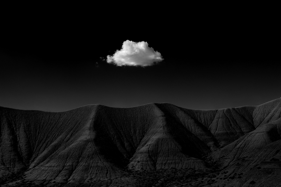
Guest Article By : Cole Thompson
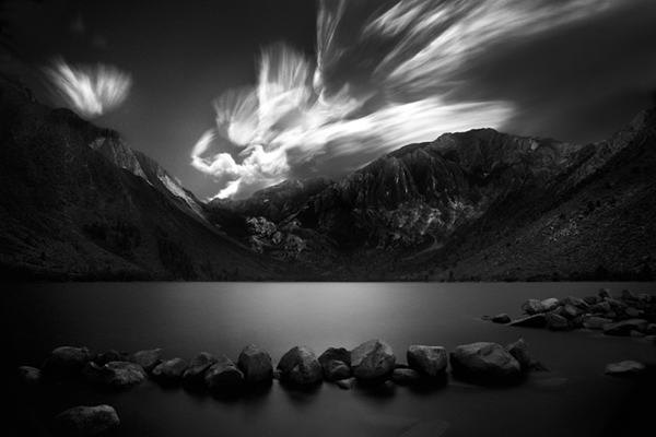
John Holland Memorial – Convict Lake, CA – 2012
What does it take to create a great image? At various times in my life I’ve had different thoughts about this; as a young man I just knew that it was the location, and if I could have photographed in Yosemite, I could have been the next Ansel Adams. Then it was equipment; at one time I thought that having a Leica would transform my work into something wonderful. Then I went through the “unique” phase, believing that the key to success was to photograph unique subjects that nobody else had photographed.
But I was wrong in each and every case; it’s not the location, it’s not the equipment and it’s not the subject that makes a great image. Great images can be created with or without those things.
After many years of searching, I’ve come to the conclusion that the secret to creating a great image is:
- 1/3 vision
- 1/3 the shot and
- 1/3 processing
While each ingredient is necessary, I do believe that the most important one is vision because that’s what drives the shot and the processing. When you have a vision and know what you want the image to look like, then photographing and processing become subservient tools to that vision.
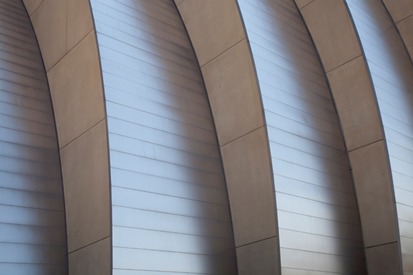
I believe in “creating an image” rather than “taking a photograph.” It may seem like a small distinction or just a play on words, but it isn’t. In using the words “creating an image,” I acknowledge that I am not attempting to capture reality, but rather I am creating something new. That means that the image I create may look quite different from the image I record with my camera. Let me illustrate with a “before and after” of one of my new images, “Moshe Safdie No. 1.”
Before
After
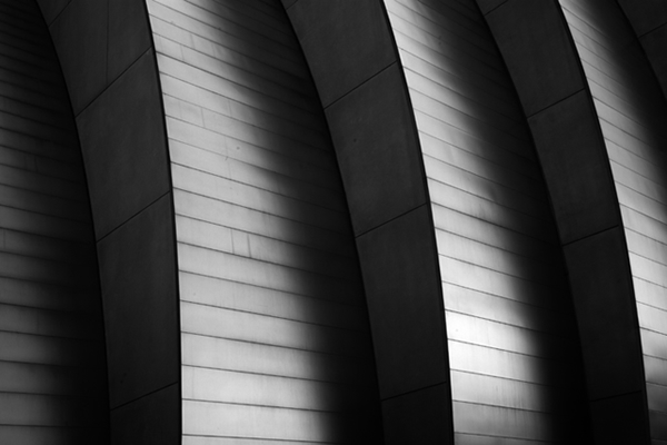
My vision directs how I photograph and how I process my image. I’m basically changing the reality my eyes saw, to how I see the image in my mind’s eye. In this article I’d like to talk about how processing helps me to create a new image.
First let me say that I try to approach things simply. Simple is elegant and helps me avoid spending unnecessary time on complicated software and procedures. It also minimizes the things that can go wrong with my workflow and makes things easier to fix when they do. Simplicity helps keep me focused on what really matters; my vision and the image.
I do all of my processing with just two tools: Photoshop and a digitizer tablet. I don’t use additional black and white conversion tools, plug-ins or special software. In fact, of all of the hundreds of features offered in Photoshop, I typically only use six of them.
Am I a Photoshop expert? Not even close, my skills are so rudimentary that for years I would hide my workflow from others for fear that they would discover me an imposter. I know so little about Photoshop and process my images so unorthodoxly that Popular Photography called me “The Photoshop Heretic.”
The point I’m trying to make is that you do not need a lot of equipment, software or skills to create great images. Believe me; if I can do it, you can too.
Here are the six tools that I use in Photoshop:
- Camera Raw
- B&W Conversion Tool
- Levels
- Dodge and Burn
- Healing Brush/Clone Tool
- Brightness and Contrast
1) Camera Raw
I shoot in RAW because it gives me maximum flexibility in adjusting the image and it produces a higher quality image. Each camera manufacturer supplies you with a RAW converter, but I find the one in Photoshop easy to use and it keeps me in a single program.
2) B&W Conversion Tool
I use Photoshop CS5 and their b&w conversion tool, and I’ve never felt the need to use one of the many standalone products. Their conversion tool has color sliders which you can adjust, and the effect is very similar to using filters on your camera, but after the fact! I never accept Photoshop’s default b&w conversion but instead spend a few minutes adjusting each color slider to see how the image is affected. I often tweak the blue channels the most and I love the effect, but you must be careful here because the trade off is additional noise.
3) Levels
Next, I use levels to ensure that I have a true black and white. People often send me one of their images to analyze because it looks flat, and the first thing I do is check the histogram to see if they have a true black and white, and they usually do not. Most people use their eyes to judge this, and they shouldn’t because monitors can be out of adjustment and your eyes can be fooled. The only accurate way to judge if you have a true black or white is to look at your histogram.
Here is an example of a histogram from an image that is flat:
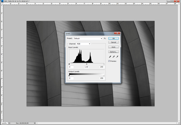
The histogram is simply a graphical representation of all of the blacks, whites and shades of grays in your image. If the graph touches the vertical line on the far left, then you have a true black. If it touches the far right vertical line, then you have a true white. As you can see this image does not have a true black or a true white. This is a common source of flat looking prints.
You can use levels to quickly adjust the image to have a true black and a true white. You do this by dragging the small black triangle (on the left) over to the right until it touches the graphed data. Then you take the small white triangle (on the right) and slide it to the left until it touches the data. This forces the image into having a true black and white. Here’s what it looks like now:
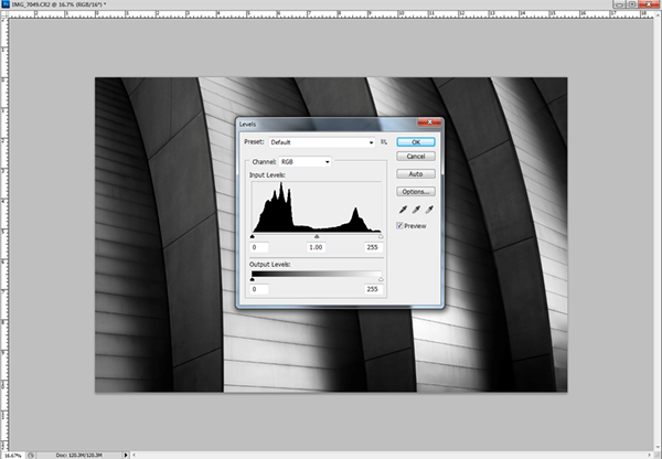
Here is the same image with a true black and white. Compare it to the original and now it’s clear how flat it was and the histogram shows us why.
There’s more you can do more with the levels tool, sometimes I’ll take the black slider and move it further to the right so that I exaggerate the blacks. I’ll also play with the midtone slider, the small grey triangle in the middle of the graph, to adjust the midtones. This midtone slider can really change the mood of your image and so I spend a moment here trying different settings.
When I’m all done using levels I have a true black, a true white and I’ve adjusted the image to have the basic look I’m after.
4) Dodge and Burn
Dodging and burning is where I do most of my real processing. These are tools I’m very familiar with from my darkroom days and perhaps that’s why I’m so comfortable with them. Dodging and burning is certainly a more labor intensive approach to image adjustment than some of the other global methods Photoshop offers, but I like the detailed control it offers. I use dodging to bring up highlights that I want the eye to focus on and I use burning to darken portions of the image that I find distracting. I also use dodging and burning together in the same area to selectively improve contrast.
Here is an image that I spent tens of hours dodging and burning to bring out the detail:
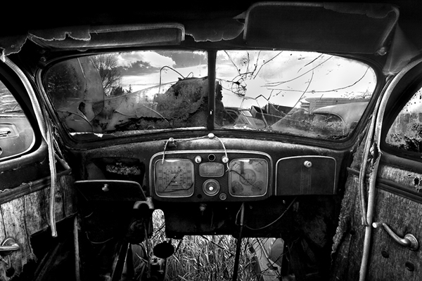
To effectively dodge and burn I use a Wacom tablet with a pressure sensitive pen, and in my opinion it is the only way a person can accurately dodge and burn.

I know many people feel they are pretty good with a mouse and do not need a tablet, but believe me when I tell you that it is essential for serious Photoshop image processing. You can pick up an inexpensive Wacom Bamboo tablet for about $100, I use a larger one at home and a small one for travelling. It is one of the best equipment investments I’ve ever made and I cannot overstate its importance!
When using a tablet for the first time, it may seem a bit awkward, but I found that after a day or two I was using it naturally and intuitively. Likewise dodging and burning can at first be a little awkward. Here are a few tips that may help.
First, work slowly. Set your exposure (strength of the brush) to 3% and take your time. I’ll often see people using a strength of 50% which will make your work look blotchy and unnatural.
Second, learn how to properly use the “range” setting. When you dodge and burn you must set the range to one of three settings: Highlights, Midtones or Shadows. This determines what tonal values you will lighten or darken with the tool. If you are dodging a highlight area, then you would set the range to Highlights.
Third, brush size and hardness is important. I’ll use a small brush for detail work and a very large brush when I want to do subtle blending. You can also choose the “hardness” of the brush which determines how hard of an edge you get. For subtle blending I’ll use 0% hardness and for detail work I might use 50% hardness. Hardness works together with the pressure sensitive pen to allow you to work more subtly and softly. Here’s a burn I did with a brush set at 0% and 100%.

The 0% hardness on the left gives you a soft edge and the 100% hardness on the right gives you a hard edge. Each has its use.
Fourth, use the pressure sensitive feature of your pen. When your burn tool is set to 0% hardness, then the harder you press on the pen, the larger and more pronounced the effect of your tool will be. This allows you to work softly or boldly. When your pen is set to 100% hardness, this pressure control is not as pronounced.
Dodging and burning is where the majority of my processing work is done and it’s more of an art than a science. The only real way to become proficient, is to practice.
5) Spot Healing Brush
I use the Spot Healing Brush to remove dust spots and imperfections from my image. I often work with 2-3 neutral density filters on my lens and my depth of field is so extreme that everything, including dust, comes into focus. This creates a lot of spotting work, especially in smooth and gradient areas such as the sky. I generally use the Spot Healing Brush to eliminate these spots, but when a spot is adjacent to a large object, this tool can pick up incorrect data and I’ll switch to the Clone tool instead.
On my Fountainhead images, I photographed into a metal mirror that revealed its many imperfections when it was in direct sunlight. Each image had thousands of spots that I manually fixed by magnifying the image 300% and using the Spot Healing Brush.
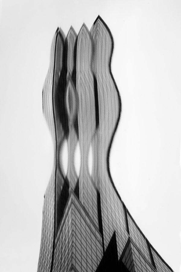
The Fountainhead No. 4 – Minneapolis, MN – 2010
But I never complain about spotting my images, I grew up in an era where you had to spot every single print you made with a small brush and a dye called SpotTone. I still can remember that distinctive taste as you licked the brush to keep the point sharp. Today we are so lucky because we only need spot a digital image once.
6) Brightness and Contrast
This last step is such a simple one, but one that’s necessary to obtain a good print. It’s fairly easy to get an image to look good on a monitor, and that’s because it’s backlit and the contrast and dynamic range are inherently excellent. But print that same image on a piece of paper that relies on reflected light for viewing, and that print can look flat and boring.
Here’s what I’ve found; once my histogram confirms that I have good blacks and whites and the image looks good to the eye on the monitor, then I must push the contrast further to get a good print. I’ll generally start off by increasing the contrast by about 30%, making a test print and then deciding if I need to go further.
Now there is a caveat, you must use a contrast adjustment tool that holds the black and white points while adjusting only the contrast in the midtone areas. This is the style of contrast tool offered in the newer versions of Photoshop. The older “legacy” style tool will blow out your highlights and block up your shadow detail as you increase contrast.
What’s my secret to a great print? Understanding the difference between viewing a print on a monitor versus a print and then pushing the contrast!
Summary

Swimming Towards the Light – Kihei, HI – 2009
This is how I process my images but I’m not suggesting that this is how you should process yours! Your processing techniques will develop from your vision and from your needs. Here’s my general rule of thumb about processing:
- Simple is always better.
- Let need dictate which tools you use.
What I’m trying to illustrate by showing you my processing techniques is that great images can be produced with the simplest of tools and skills. You don’t need a lot of extras, and in fact they sometimes can get in the way.
For me it’s all about the image. While processing is not “the” key to a great image, when driven by vision it is a powerful component.
You can find Cole Thompson on the Web :
Copyrights:
All the pictures in this post are copyrighted to Cole Thompson. Their reproduction, even in part, is forbidden without the explicit approval of the rightful owners.

