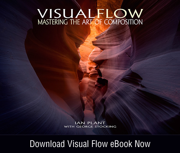
What makes a great photograph? Is there any one aspect of the process which separates the merely good from the truly magnificent? Many candidates immediately spring to mind, such as subject matter, light, mood, and moment. One aspect clearly rises above the rest, and is the thread which ties all of these other qualities together. Composition—the artistic arrangement and placement of visual elements within the picture frame—is the most difficult aspect of the art of photography to master, and also the most important.
In my newest ebook, Visual Flow: Mastering the Art of Composition, I discuss a number of compositional tools and techniques which have been used by the masters of painting and photography for centuries. Here’s what I consider to be the top ten techniques for mastering the art of composition.
1. Learn to think in the abstract
Famous photographer Minor White once said “One should photograph objects, not only for what they are, but for what else they are.” What he meant by this is that a photographer should learn to think abstractly about composition. Try not to think literally about objects in your scene—don’t think of them as waterfalls, mountains, trees, etc.—but rather think in terms of the shapes they form, perspective (depth and scale), space (the placement and arrangement of elements), and color. This process is an important first step: once you start seeing elements of a scene in abstract terms, then you’re ready to start tackling advanced compositional techniques.

2. Get your feet moving
Ansel Adams once said “A good photograph is knowing where to stand.” Thoroughly exploring a scene is the best way to ensure that you find something compelling and original. A little bit of curiosity goes a long way—if you aren’t asking yourself questions like “What would the view look like from that small hill over there?” then you are limiting yourself to only the most obvious shots. If you want to make unique and meaningful compositions, you need to get your feet moving, and experiment with different angles, focal lengths, and relative positions. Only then can you really see what the world has to offer.

3. Use “power shapes” to create bold compositions
Simple shapes such as triangles, circles, radial patterns, curves, lines, and zigzags attract the eye, lending themselves to simple yet bold compositions. Sometimes the shape can be the basis for the composition itself, whereas other times it can merely be the background structure for a more complex composition.

4. Create depth in your photos
Manipulation of the relative size of objects can help you create depth in your photographs and lead the viewer’s eye into the scene. One powerful technique that does this is called forced perspective, which employs optical illusion to make an object appear more prominent than it actually is. This is usually accomplished by getting close to a near object with a wide-angle lens, thus exaggerating its size and visual importance relative to more distant objects. Forced perspective can become a powerful tool used to create dynamic visual relationships between near and far objects.

5. Direct the viewer’s attention
Leading elements are useful for compelling the viewer’s eye into the photo. Leading lines which stretch from foreground to background are especially powerful. Other shapes placed in the foreground can accomplish the same thing; a curving river can encourage the eye to meander throughout the scene, whereas a triangle-shaped rock can point into the composition. Multiple visual elements, arranged properly, can encourage the viewer’s eye to travel deep into the scene; a near-to-far, bottom-to-top visual progression is often particularly effective.

6. Visual repetition attracts the eye
People are naturally attracted to patterns. Use repeating shapes and colors to get the viewer to visit multiple parts of the composition.

7. Use space as a compositional element
Don’t just rely on objects when creating compositions. Empty (or negative) space can be used as well. For example, empty space on one side of a composition can balance against objects placed on the opposite side.

8. Frame your subjects
Framing is an effective tool for creating depth in a photograph, simplifying a composition, and focusing attention on important elements of the scene. Examples of commonly used frames include trees, natural arches, and old barn windows. Sometimes framing shots work best if there is an element of contrast between the frame and the subject—for example, silhouetted trees framing a sunlit mountain peak.

9. Get the viewer’s eye moving
Look for ways to get the viewer’s eye engaged in multiple points of interest in your photos. Visual opposition is the key to dynamic compositions—opposing elements create energy. Look for lines or shapes which tilt or point in opposite directions; a balanced arrangement of these elements can be powerful.

10. Provide a logical starting place for the viewer’s visual journey
By providing an obvious point of reference for viewers, you not only help direct their visual movement throughout the image, but you can also simplify an otherwise chaotic scene. Visual anchors are simple yet compelling elements that are typically placed in the foreground of an image, providing this much-needed point of reference. The best visual anchors serve to lead the eye deeper into the scene, and then attract the eye back to the anchor, staring the process over (and hopefully over) again. The effect is a composition that captivates the viewer, making it hard for them to tear their eyes away from the photograph.

AUTHOR BIO
Ian Plant is a full time professional nature photographer, writer, and adventurer. His work has appeared in numerous books and calendars, and he is a frequent contributor to leading photo magazines including Outdoor Photographer, Popular Photography, and Landscape Photography, among others. He is also the author of a number of ebooks and digital processing video tutorials. You may see more of his work on his website http://www.ianplant.com


