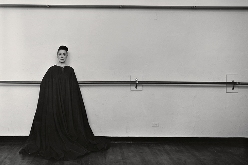
Amazing Tips about Simplification and Negative Space in Photography Composition by Ted Forbes. Subscribe The Art of Photography You Tube Channel for more informative videos.
Simplification is the reduction of elements in the composition to only what is necessary for the picture. Its a concept very difficult for photographers for a number of reasons. If you are creating the art – in other words, you are drawing or painting, its more natural not to add things to the composition that aren’t important. But as photographers – particularly if you’re not in a studio, we don’t have the ability often to physically remove objects from what we are photographing. This means sometimes you have to reconsider your angle, point of view or any number of changes to the way you’re shooting that will interrupt your normal process. This can be quite difficult.
For example, if you’re shooting a landscape and there is a street light in the frame, the light might be more distracting to the composition than needed. This is an obvious example, but say you’re doing architectural work. Are there chairs in the composition? Do they need to be there? Is their placement complementing what you are trying to say with the image? Simplification is pairing down subjects to only the essential.
Its worth noting that this sounds like minimalism. While reducing elements is a big part of minimalism, it doesn’t imply that your photograph is minimalist. On the base level, it simply means that everything in the composition is there to serve a purpose and no element is distracting.
The second technique we’ll cover in this video is “negative space”. Negative space is simply areas of low texture or activity that contrast the subject and allow it to “breathe”. This is very natural to how we exist as humans. Being in a situation that’s too crowded can make us feel stifled or claustrophobic. Images are similar. We create interest by allowing things room. This also creates impact and gives importance to subjects that contrast this negative space. Negative space can be simple backgrounds, skies, flat colors, black, white, etc.
These techniques are quite simple, but they are both surprisingly difficult to get a handle on – particularly for photographers.


