Andrew Harrington’s photography reveals itself slowly. There is no obvious signature or visual hook designed to demand attention. Instead, his work is built on deliberate, repeated decisions—restraint over excess, structure over flourish, distance over intimacy. The images feel resolved before they feel expressive, shaped by judgment rather than impulse.
Across editorial, commercial, and personal projects, Harrington maintains a consistent visual logic. His photographs resist spectacle and avoid unnecessary emphasis, allowing composition, pacing, and space to carry meaning. In an industry driven by novelty and speed, his approach feels measured and intentional, rewarding viewers who stay with the image long enough for it to work.
More info about Andrew:
A Pattern Defined by Discipline
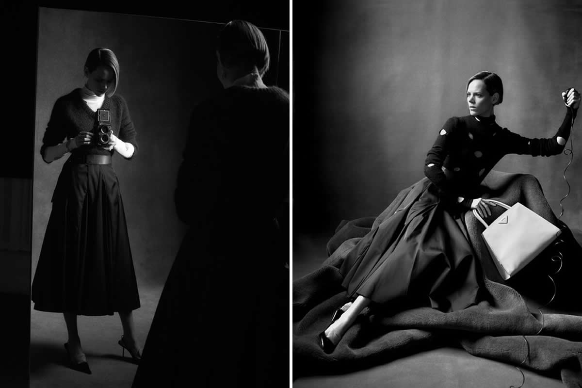
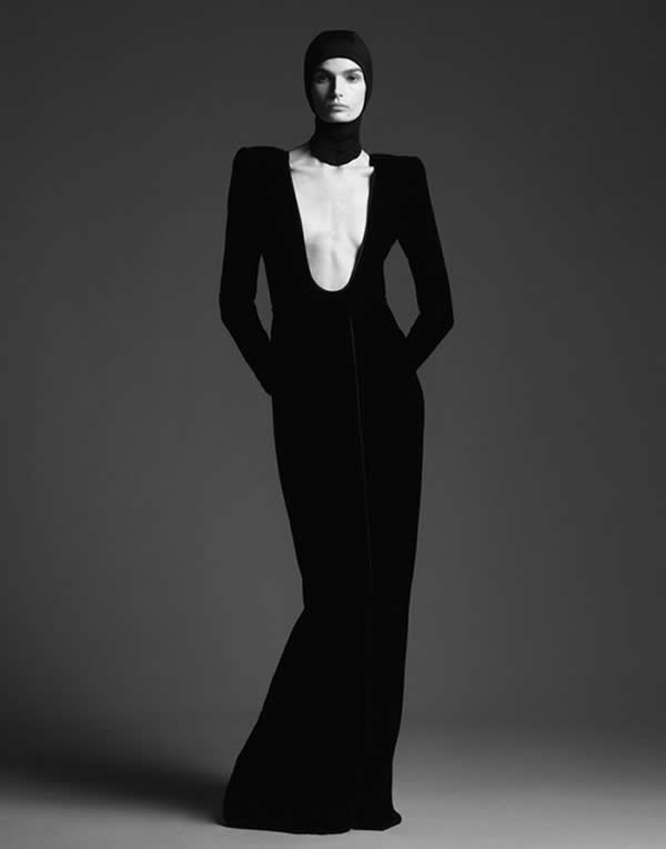
Look long enough at Andrew Harrington’s work and a pattern emerges. Not a signature look in the obvious sense, but a set of decisions repeated with discipline. Distance over closeness. Structure over flourish. Images that feel resolved before they feel expressive.
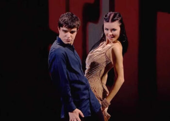
Across his editorials, campaigns, and personal work, Harrington operates with an unusually consistent logic. The frame is never crowded. Subjects are rarely centered in the way fashion photography often demands. Bodies lean, turn, or interrupt themselves. Faces are obscured just enough to keep the image from becoming declarative. What matters is not the individual image alone, but how it holds up alongside the next one.
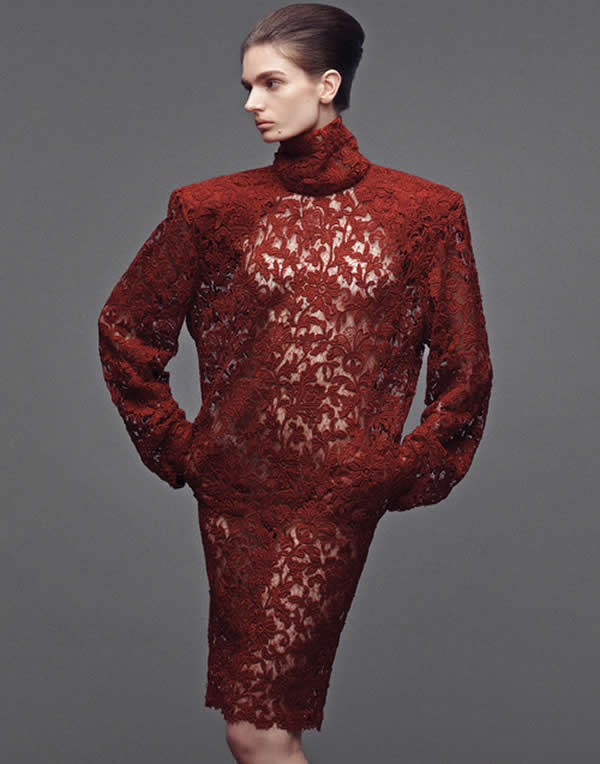
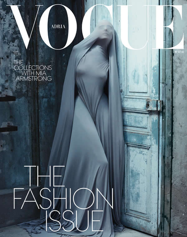
Editorial Work That Resists Excess
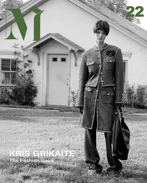
This becomes especially clear when moving through his editorial work for Vogue Australia, Vogue Italia, and Financial Times HTSI. The photographs do not chase novelty. They sit comfortably within the visual language of contemporary fashion media while quietly resisting its excesses. Styling is precise but never overemphasized. Lighting is controlled but not dramatic. Motion appears when it serves the structure of the image, not when it adds excitement.
Commercial Campaigns, Same Visual Logic
Harrington’s commercial work follows the same rules. Campaign images for brands like Prada, ZARA, Urban Outfitters, and Anthropologie do not abandon his editorial instincts. If anything, they sharpen them. The compositions are cleaner. The decisions are more economical. There is a confidence in leaving space unused, in allowing the image to breathe rather than fill every inch with information.

Production Fluency as Creative Advantage
What separates Harrington from many photographers working at this level is his fluency with production. His background in studio operations and large-scale shoot coordination is not incidental. It informs how the work is made and why it looks the way it does. These photographs feel planned—not storyboarded to death, but thought through. There is a sense that the photographer understands the entire machine behind the image and knows exactly how much pressure to apply.
Pacing, Anonymity, and Controlled Uncertainty
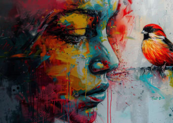
This shows up in the pacing of the work. Harrington’s images rarely feel rushed. There is no visual panic. Even when motion blur enters the frame, it feels controlled, intentional, and restrained. The blur does not add chaos. It reduces certainty. It prevents the image from collapsing into something too final.
Another recurring choice is anonymity. Harrington consistently avoids over-identifying his subjects. Eyes turn away. Faces fall into shadow. The image resists biography. This shifts attention from who the subject is to how they exist within the frame. Posture, balance, tension, and silhouette become the real content.
Consistency Over Reinvention
What Harrington offers is not reinvention, but consistency at a high level. His work does not hinge on shock, trend, or excess. It hinges on judgment—knowing when an image is finished, when to stop adjusting, when restraint will carry more weight than amplification.
In a visual culture optimized for speed, Harrington’s photography moves at a different pace. It assumes time. It assumes attention. It assumes the viewer is capable of staying with the image long enough for it to work. That assumption is the quiet strength of the work. It does not beg to be seen. It expects to be taken seriously.


